Review: New Super Luigi U (Wii U, 2013)

New Super Mario Bros. U is my favorite side-scrolling Mario game since 1991’s Super Mario World. And yes, that includes Yoshi’s Island, which is a game I enjoyed and completed, but stopped short of achieving 100% in every stage.

The New series of Mario games got its start back in 2006 on the Nintendo DS. It built off of the series’ past successes on the NES and Super NES, and marked Nintendo’s return to classic, side-scrolling 2D gameplay. The world was ready, and so was I.

20140926_nsmb_dsUnfortunately, I didn’t really care for it. Something about it felt off, and at least on the DS, I didn’t like its low-fidelity visuals and sterile design. In fact, it took me close to six years to finally finish it, and that’s mostly because I wanted to have a baseline on which to compare its three sequels.

Thankfully, New Super Mario Bros.‘ follow-ups — New Super Mario Bros. Wii, New Super Mario Bros. 2 on the 3DS, and New Super Mario Bros. U — are all superior, with the Wii and Wii U versions being my favorites.

The 3DS game looked and played well enough, but I thought it was way too easy with watered-down design.

nslu_boxAfter completing and thoroughly enjoying New Super Mario Bros. U, I didn’t immediately purchase its Luigi-based DLC. I thought $20-30 was too much to pay for what was in my mind just some remixed levels starring Luigi. I had this idea in my mind that if Nintendo was able to put all of the extra Luigi content in a game like Super Mario Galaxy 2 for the original asking price, why were they charging so much extra for this?

Now that I’ve played through this game in its entirety, in hindsight, that opinion can only be seen as my own ignorance.

New Super Luigi U is a great game. Although it is technically DLC — and it requires New Super Mario Bros. U to function if you buy it digitally — it plays like a brand-new game, full of new ideas and challenges.

Oh, and I did buy the physical version, which does not require the original game. Plus, you gotta love that green case!

Anyway, Luigi U borrows its graphical and musical assets from its parent Mario game, and it also has the same world map, but the levels themselves have been completely redesigned, and you are now at the mercy of a reduced timer that starts at 100 instead of 400.

20140926_nslu_1

You not only have to contend with less time, but with Luigi’s drastically different controls and physics. He jumps much higher now, can float in the air momentarily, and has a tendency to slide around like a wet noodle, so unless you’re just a platforming natural, it will take some time to get used to these changes.

You will be frustrated on many occasions as your attempts to grab items, dispatch enemies, dodge environmental hazards, and collect the three special Star Coins in each level, will lead to your death. But once you get used to it, this becomes an absolute blast to play.

Levels are shorter, there are no checkpoints, and extra lives can be scarce when you most need them, so the game remains challenging from several different perspectives. That’s a rarity in modern game design.

You will also have to chase and catch Nabbit from time to time, which is fun and necessary to do if you want to attain 100% completion status.

20140926_nslu_2

Graphically, Luigi U is beautiful to look at, with all of the subtle touches and artistic brilliance that adorned New Super Mario Bros. U. The highlight here, however, is that there are hidden Luigis all over the place. They are sometimes obvious, but many of them are cleverly hidden or blended in with the backgrounds. These are all fun to find and uncover, and since they are often found near a Star Coin, their discovery becomes that much more meaningful.

The game runs at a rock-solid 60fps at 720p resolution, and I don’t remember seeing a single bit of slowdown. The New style has been controversial for close to a decade, and you either love it or hate it. I think it looks its best on the Wii U, with crisp design, silky-smooth animation, tons of depth, and gorgeous environmental effects.

On the audio side of things, it’s… New Super Mario Bros., which is to say it isn’t all that memorable. When you compare it to something like Super Mario Galaxy, you can’t help but feel like the New series simply plays it too safe in the sound department.

It’s whimsical with some standout tracks, but for the most part, it’s derivative and not a soundtrack I’d listen to when I’m not playing the game. On the flipside, Luigi U‘s sound effects are crisp, classic, and full of a variety of voice samples. They’ve gotten to the point where they sound totally natural, as opposed to how awkward they were when Nintendo shoehorned them into the Game Boy Advance titles.

20140926_nslu_4

Getting back to that time limit I mentioned earlier, I wish this game had better Miiverse and ranking integration. While you can manually post your times, a more traditional and automated leaderboard system would be great.

It would also be fantastic if for the next game, they add in Miiverse replays like the ones in NES Remix 2. As it is now, the Miiverse comes off as mostly negative, since the majority of the posts you’ll see will be from frustrated players who have died at various points throughout the game.

Another small complaint is how long it takes to retry a stage after you die, which takes about 12 seconds each time. I wish it would just ask me if I want to try again instead of kicking me back out to the world map only to turn around and go right back in. It doesn’t take too long, but it takes just long enough to be an unnecessary nuisance.

Finally, something that would make this game even better is having the gold flag requirement, like in Super Mario 3D Land (3DS) and World (Wii U), or introduce a Rainbow Stars requirement for each stage, like the NES Remix titles. This game already has a lot of replay value, but these would put it over the top, and reward repeat efforts.

20140926_nslu_3

All in all, I had a great time playing New Super Luigi U. As someone who absolutely loved Mario’s first outing on the Wii U, playing through this world again with completely different levels and character physics was a welcome challenge that at times pushed my abilities to their limits.

How Nintendo will top this brotherly combo is something that’s hard to imagine. New Super Luigi U represents some of the finest in Nintendo 2D platforming.

  • Graphics & Presentation: B+
    You either love or hate the New style, and while I’m not a big fan of it, Nintendo has definitely improved upon the handheld and Wii installments with lovely backgrounds and animation to die for. 60fps 720p shows how Nintendo’s flagship franchises can shine in HD.
  • Music & Sound Effects: B
    Mario Galaxy and 3D World this is not. The soundtrack is solid, but it relies too heavily on past melodies and influences. Themes like the underwater one are superb, but the standouts are the exception rather than the rule. Excellent sound effects and voice samples bring the characters to life.
  • Gameplay & Controls: A
    Luigi feels really loose at first, but they become second nature after several stages. It’s fun to collect the Star Coins, Hidden Exits are tricky, and all of the secret Luigis strewn throughout each world will make you smile. Platforming can be super-tough and the game isn’t overly generous with 1UPs.
  • Value: A
    It will take about 15-20 hours to get through this. Compared to most DLC and season passes, $20-30 sounds like a lot, but given how much content there is, it represents more than you’ll get out of a lot of $60 purchases. Going for perfect, no-hit runs will keep speedrunners coming back for more.

Overall: A
 

Facebooktwitterredditpinterestlinkedinmail

Five months at Gray-Haired Gamer

20140923_batman_originsDid I really start this in April? It’s funny looking back at some of my earlier stuff. My Batman: Arkham Origins review is so short, and my Persona 4 Golden review seems odd and doesn’t even read like a review.

I think this site is at its best when I’m writing about my past, or talking about the things that have influenced me. It gives me a chance to dive deep into things that mean a lot to me, or the people who have shaped who I have become, whether they are colleagues, friends, or family.

That’s not to say that I don’t like writing reviews or sharing my latest progress through what I’m currently playing. That’s also good, and it gives me an outlet for more structured pieces. For those progress reports specifically, I’ve found that YouTube has been a much better way to share them. It gives me the opportunity to not just show you exactly how I’m playing through these games, but it lets me share the thought process, mistakes, and other impressions of the series they’re based on or influenced by.

This has been highly rewarding and it only seems natural that the next step will be to set up a webcam to literally face the world when I speak. Soon, I promise!

Although my updates on the blog have not been daily as I originally set out to do, I have tried to post something daily across one or more of the other GHG outlets, so if there isn’t content being posted here, I’ll definitely be posting something elsewhere, whether it be YouTube, Twitter, or Google+.

If you follow me elsewhere, you might have seen the music video I put together last week:

I love doing things like this, and even though this video is mainly about the games I loved when I was in my early and late teens, it was also an exercise in synchronizing video to audio, which is a seriously time-consuming process.

I’m guessing there are better tools out there to make this easier, but I just did it all based on the song’s waveform. Anyway, I’m happy with the way it turned out, although I thought of at least a hundred other games I’d love to feature in future videos. I just need to figure out which songs to use.

As you saw last week, my Backlog Blitz progress for 2014 has been pretty solid. A few slips here and there, but I’ve managed to stay ahead up to this point, and I don’t intend on slipping before the new year!

So what’s next? Well, for one, I’m going to get back to my Industry Memoirs series. I’ve still only written up to the end of 1996, so there are many more years to write about. Lots of ups and downs to be certain, but mainly ups.

20140923_sh_sat_loadI’m also going to do some more in-depth videos on games or series that have influenced me. I’ve written about some of them, such as Space Harrier and Phantasy Star, but I’ve been wanting to do accompanying videos for them, which I think will be a lot of fun to produce.

I’ll likely start with Space Harrier, since it’s one of my all-time favorite arcade games, and I can’t wait to show and talk about the various versions I played, its sequels, and how it’s a series I hope Sega properly brings back in the way they did with Out Run 2.

Anyway, thanks for continuing to check out the blog. While I’ve expanded my horizons a bit and have definitely been focusing more on video content lately, I still very much love writing about games, so please look forward to many more updates.

Facebooktwitterredditpinterestlinkedinmail

Backlog Blitz: The Games of August 2014

20140916_ghg_backlog_aug_14

Where does the time go? I can’t believe it’s already mid-September! It was a pretty even month, even though I did buy more than I finished. However, a couple of the games I finished rank as some of my favorites of the year so far, so I’m OK with that.

All in all, I finished -2 for the month, but I’m still +6 for the year. Anyway, the format, as with previous updates, is Game Title (Platform, Purchase Price, Play Time).

Games purchased (-5, $56.50 spent):

  1. 20140916_ghg_ff10Final Fantasy X/X-2 Remaster (Vita, $20.00)
    I was pretty torn on this purchase because I do like Final Fantasy X — it was the last game in the series I ever finished — but I really don’t care for its sequel, X-2. There’s a part of me that wants to go back and play earlier entries in the series, though, and since I only finished this game once on the PlayStation 2, I figured playing it again in portable form on the Vita would be a good way to experience it again. My guess is most of it will feel new since it’s been over ten years.
  2. Chrono Cross (Vita, $5.00)
    Since this game was part of August’s sale on PSN, I added it to the library. While I like Chrono Trigger on the Super Nintendo more, there’s a lot to like in its follow-up, especially the music, which is just sublime. I remember not liking the more serious tone and slower pace of the game itself, which is common to many PlayStation 1-era RPGs, but like Final Fantasy X, I think playing it on the Vita will be fun.
  3. The Humble Mobile Bundle 6 (Android, $4.50)
    Another month, another quality bundle for Android users. This bundle includes Carmageddon, Combo Crew Special Edition, Duet Premium, Eliss Infinity, Joe Dever’s Lone Wolf: Full Game, Llamas with Hats: Cruise Catastrophe, Mines of Mars, Threes!, and Time Surfer. Worth the price of admission for Threes! alone. What a great game.
  4. The Humble Sega Mobile Bundle (Android, $4.00)
    Although I’m not a fan of playing games that aren’t specifically designed for touchscreens, this Sega bundle had quite the solid offering. When are they going to make a proper Out Run game for mobile? Seems like the perfect platform, don’t you think? Anyway, this bundle includes the following: ChuChu Rocket!, Crazy Taxi, Happy Sonic! Live Wallpaper, Sonic & Sega All-Stars Racing, Sonic CD, Sonic the Hedgehog 4 Episode I, Sonic the Hedgehog 4 Episode II, Super Monkey Ball 2: Sakura Edition, and Virtua Tennis Challenge.
  5. Kero Blaster (PC, $8.00)
    From Daisuke “Pixel” Amaya — the creator of Cave Story — for only $8 on Playism, this one was a must-buy. Their website is a no-frills affair, so I didn’t feel all that confident making my purchase. I got my game, though, and started playing it shortly thereafter.

Games finished (+3, $26.00 value):

  1. 20140811_1001_spikes_review_4Aban Hawkins & the 1001 Spikes (Wii U, $15.00, 20 hrs.)
    This was a very fun game, with surprisingly good presentation, multiple endings, and lots of different modes to play. Although some of it feels half-baked on the Wii U with no off-screen play and tons of audio glitches, it is still a robust game at its core that delivers a ton of bang for the buck, and is one of the most challenging titles I’ve played in 2014 so far. Recommended! Overall: A-
    REVIEW LINK
  2. Threes (Android, $1.00, 10 hrs.)
    Much better than the very similar game Eights, this one has great personality, intuitive controls, and that “just one more try” addictive quality that makes it a great play anywhere, anytime game for your phone. Overall: B+
  3. Volgarr the Viking (PC, $10.00, 40 hrs.)
    In my written and video review, I summed this game up by saying that it’s my favorite of 2014 that wasn’t released in 2014. It’s a game that truly respects the player’s patience, understanding, and perseverance, and it comes with my highest recommendation. And now I shall pray to the Allfather Odin that Crazy Viking Studios will produce a sequel. The world existing with only one Volgarr game would be criminal. Overall: A+
    REVIEW LINK

Only three and a half months left in 2014! I’m bracing myself for the holiday sales, but I feeling (cautiously) optimistic that I can stay above zero before 2015 kicks off.

Facebooktwitterredditpinterestlinkedinmail

Review: Nintendo Wii U Pro Controller (PC)

20140910_ghg_wii_u_pc_01

The Wii U Pro Controller is an interesting beast. It gets a lot of things right, but it also misses the mark in a few key areas too.

I bought one almost immediately after purchasing a Wii U back in October of 2013. Like many other owners, I was feeling rather paranoid about the GamePad breaking, so I wanted the Pro Controller to use for anything that supported it. I’ve used it for most of the games I’ve played on the console, including Super Mario 3D World, New Super Mario Bros. U, and Mario Kart 8.

20140910_ghg_wii_u_pc_06

Due to the fact that I did buy it almost a year ago and am only reviewing it now, I don’t have the packaging to show you. It does, however, come wrapped in protective padding inside a box, and is not simply sealed in a blister pack.

Most notable is the fact that unlike the DualShock 4 and Xbox One Wireless Controllers, the Wii U Pro Controller includes a mini USB charging cable. It might seem silly to call this out because of how cheap USB cables are, but it’s thoughtful of Nintendo to include one.

Finally, this controller streets for about $5-10 less than its competitors, so that’s another nice benefit.

20140910_ghg_wii_u_pc_09

That lower price is good, because if you are thinking of using this controller as a PC gamepad — which is what this review focuses on — you’ll want to spend about $15 to get the Mayflash Wireless Wii U Pro Controller to PC USB Adapter from a retailer like Amazon.

It’s a handy little adapter that only takes a minute or two to set up. Just install the drivers from the included 3″ CD-ROM (or download them from HERE), plug in the adapter, sync your controller, and you’re ready to rock and roll.

20140910_ghg_wii_u_pc_10

The adapter supports both DirectInput and XInput, so select whichever one is best suited for the game or application you want to use.

For most games — especially modern titles — XInput will be what you want, but there may be older applications that work better with DirectInput, so try the latter if you run into any compatibility issues.

20140910_ghg_wii_u_pc_11

One important thing to note is that in XInput mode (pictured above-left), the Mayflash device maps the buttons to match the Nintendo layout, so instead of XY/AB on an Xbox controller, it’s YX/BA.

I realize that this is more “Nintendo authentic”, but it’s an added hassle for those who just want to use one of these instead of standard 360 pad on a PC. DirectInput (pictured above-right) also has different mappings, so pay attention to your button assignments in your game or application in either mode. Remapping will likely be required via an additional app such as Durazno.

20140910_ghg_wii_u_pc_03

Getting back to the controller itself, it’s nicely shaped and fits comfortably in your hands. Size-wise, it’s similar to the Xbox One and DualShock 4 controllers. It does feel slightly lighter in terms of weight, but not as dramatically so as some outlets have reported.

I really don’t like the glossy finish, though, which is something Nintendo started implementing last generation on their Wii Remotes. Yes, they look nice, but they’re fingerprint magnets.

Impressively, however, mine hasn’t shown any signs of scuffs or scratches. The finish itself seems to be very durable, as opposed to the smooth d-pad and face button bases on the DualShock 4, which after only a week, already has light scratches.

20140910_ghg_wii_u_pc_04

The d-pad, analog sticks, and face buttons are all excellent and responsive. They are more or less identical to those found on the GamePad, so transitioning between the two controllers is easy. Nintendo has had a great track record when it comes to producing controllers with terrific d-pads and buttons, and the Pro Controller is no exception.

The Power and Home buttons sit slightly recessed in the center of the controller so as not to get accidentally pressed during play. The Select and Start buttons are easy to locate, similar to the Xbox One controller.

20140910_ghg_wii_u_pc_07

The L/R and ZL/ZR triggers also feel great, and I prefer the Z trigger placement more on this controller than the GamePad, although it is a slight bummer that Nintendo didn’t design the Z triggers as analog ones.

On the underside of the controller is the Sync button, which is located in such a way that it would be pretty difficult to accidentally press it.

20140910_ghg_wii_u_pc_05

Regarding the Pro Controller’s layout, I don’t really care for it. While I totally get that they did it to mirror the one found on the GamePad, they are unfortunately placed in such a way that your thumbs don’t land naturally.

On the GamePad, my thumbs land right on the analog sticks and can be easily moved to reach the d-pad and face buttons. The angles are perfect and they feel great. Honestly, I didn’t think the GamePad would be as comfortable to use as it is.

On the Pro Controller, however, while analog stick placement is perfect, my thumbs — especially my right one — have to strain to get them in optimal position to reach the d-pad and face buttons. I think the problem is that they are spread too far apart.

If Nintendo revises this controller, I’d recommend moving them in closer together and adjusting the spacing on the face button cluster. As of now, the layout feels a bit rushed.

20140910_ghg_wii_u_pc_08

It’s interesting comparing the Wii U Pro Controller to the one for the Wii. While the Wii version feels like a toy and annoyed me with the fact that it had to be plugged into a Wii Remote to function, it just felt more natural to use.

Again, I know Nintendo had to be consistent between the GamePad and Pro Controller, but as of now, the layout doesn’t translate that well.

In closing, I like the Wii U Pro Controller in terms of overall comfort, build quality, responsiveness, and feel, but I’m not a fan of its “different from everyone else” configuration. While this is not Nintendo’s fault, I also wish Mayflash’s default Windows button mappings were identical to those of a 360 controller. Having them flipped introduces an additional remapping step that makes this controller a solid choice for retro gamers, but not for those looking for a seamless 360 controller replacement.

And even for oldschool gaming, there are other excellent and cheaper controllers and adapters out there. While I can’t recommend this for PC gaming, I do think it’s a good controller for the Wii U that reduces wear and tear on the more expensive GamePad.

For the Wii U: B+
For the PC: C

Overall: B-


Facebooktwitterredditpinterestlinkedinmail

Review: Sony DualShock 4 Wireless Controller (PC)

20140909_ghg_ds4_09

This generation has been a strange one for me. I’m typically the kind of person who will buy new consoles at or near launch, regardless of what titles are available. Case in point? I paid an ungodly amount of money for an import PlayStation 2 in early 2000, and the only game I bought it for? Konami’s Gradius III & IV. Don’t ask. It’s not my proudest moment.

The only current-generation console I own is a Nintendo Wii U, and even with that, I waited almost a year before taking the plunge. With nothing really pulling me towards either an Xbox One or PlayStation 4 at the moment, and with most of my time being spent playing games on PC, I thought now would be the perfect time to compare how each of the current-generation console controllers perform on my rig.

I reviewed the Xbox One Wireless Controller last month, and I came away very impressed with it. It’s easily the best controller Microsoft has ever produced, with thoughtful, even inspired design. It has some areas where it could be improved, but overall, it’s become my go-to PC controller.

Although the Xbox One controller is the preferred way to go on the gaming forums I visit, as a reviewer, I felt the need to give the other manufacturers a fair shake, including Nintendo’s Wii U Pro Controller, which I’ll be reviewing soon. So with that, I picked up a DualShock 4 on Amazon last week and put it through its paces.

20140909_ghg_ds4_01

To begin with, the packaging on the DualShock 4 is pretty good. It’s not as premium as Microsoft’s, but it’s not a cheap blister pack either.

The front features a molded, clear plastic insert so that you can see the actual controller.

20140909_ghg_ds4_02

Turning the box over, the back highlights some of the DualShock 4’s updated and new features, including the touchpad, Share button, integrated light bar, built-in speaker, and standard 3.5mm headphone jack.

It also notes that a USB cable is not included with the controller. The Xbox One controller came the same way: sans USB cable. They’re so cheap that I wish manufacturers would just include one to save customers the extra hassle of buying one.

20140909_ghg_ds4_03

The packaging itself it easy to open. Included inside along with the controller is a small instruction manual. Since pairing is done differently on the PS4, note that for PC you put the controller into Bluetooth pairing mode by holding down Share (The Button Formerly Known as Select) and the PS button at the same time until the light bar flashes rapidly.

Other things you’ll want to have if you’re using this on a PC:

As I alluded to earlier, you’ll need a micro USB cable — like this one — for charging and playing with a wired connection, which is how I prefer to play.

Alternately, if you want to play wirelessly, you will need a compatible Bluetooth receiver. I tried a Kinivo BTD-300 Bluetooth 3.0 USB adapter with Windows 7 SP1, and I had no problems pairing.

20140909_ghg_ds4_15

You’ll also need the DS4Windows software, which you can learn more about and download HERE.

If you don’t use this software or something similar to it, the DualShock 4 will still function as a HID-compatible device, but you will not be able to utilize any of the controller’s additional benefits — including a number of XInput features — so it is recommended that you do so unless you have a game or application that has legacy compatibility problems.

This software also allows you to customize the controller, record macros, create per-application profiles, and use the touchpad for mouse input. It’s a terrific program that once again shows what talented, independent developers can create.

Once everything is installed, the DualShock 4 will be automatically mapped and function exactly like an Xbox 360 or Xbox One controller. Pretty nifty!

20140909_ghg_ds4_16

Focusing on the controller itself, it’s worth noting that this is the first significant shape change for the DualShock line since the original PlayStation. While the layout and overall design is familiar, just about everything has been updated, and mostly for the better.

The grips are thicker, rounder, and extend further than they did on the DualShock 3, giving the controller a much more comfortable and sturdy feel. The shoulder buttons now sit more flush with the controller housing instead of being set on top of the old “Black Mesas”, as I like to call them.

20140909_ghg_ds4_05

The most significant update is the touchpad, which didn’t make much sense to me until I actually used it. It functions just like a notebook touchpad, it can be left- or right-clicked, and supports multi-touch for smooth page scrolling.

This makes using it on a PC a fantastic experience, where many games and applications tend to work better if you have a mouse handy. It’s nice to be able to navigate menus and other Windows-specific tasks without having to put the controller down.

20140909_ghg_ds4_06

Underneath the analog sticks are two ports: an extension port and a standard 3.5mm headphone jack. I don’t believe audio output it supported on PC at this time, but I’m very happy to see Sony not using a proprietary connector for this or the USB charging port.

The PS button remains in approximately the same place as it was on the DualShock 3, and above it is now a built-in speaker, similar to what is found on the Nintendo Wii Remote. Like the headphone jack, however, it doesn’t look like this feature is supported on PC yet.

20140909_ghg_ds4_11

The infamous light bar also illuminates by default when using it on a PC to communicate charging level and power, but thankfully you can disable this function via DS4Windows’ profile settings, as well as fully customize its colors.

Personally, I leave it off except when I’m using it wirelessly. This way there’s no second-guessing whether it’s on or off.

20140909_ghg_ds4_07

The analog sticks have been redesigned, sitting a little lower than they did before, with a smoother feel and slightly higher resistance. The classic convex tops of past DualShocks have been replaced with a thinner, more recessed design, but to me, they feel cheaper in quality and less comfortable to use than the Xbox One’s superb design, and to a certain degree, even the DualShock 3.

However, the redesigned d-pad is absolutely a winner. As much as I have loved every PlayStation console over the past two decades, I’ve never been a fan of their d-pads. They’re small, somewhat mushy, and the split design can wreak havoc on your thumb.

While the split design is still present here, it is now flared and slightly larger, possessing better curvature too. It is a joy to use, both with its crisper feel and better tactile feedback. Whether you go with this, an Xbox One controller, or the Wii U Pro Controller, d-pad fans won’t be disappointed.

20140909_ghg_ds4_08

The Square, Triangle, X, and O face buttons have also undergone some minor changes. They’re similarly sized as before, but are arranged in a slightly tighter cluster. It’s only noticeable when you stack a DualShock 3 directly on top.

The buttons themselves are now flatter, and I’m not entirely sure if it’s just because the controller is brand-new, but they feel snappier and quicker than the DualShock 3’s.

The Share and Options buttons, though, which used to be Select and Start on past consoles, are a disappointment. Their location is good, but they sit flush with the controller housing, and don’t really have much of a feel to them.

They share a similar design with those found on the original Vita, but they don’t click nicely like they do on Sony’s handheld. As a result, I found myself pressing the Options button overly hard to pause games. A slightly raised or convex design would do wonders in making these buttons feel more confident during play.

20140909_ghg_ds4_10

The L1/L2/R1/R2 triggers are also an improvement over the DualShock 3. I’m not sure what Sony was thinking when they made the PS3 analog triggers convex, but it spawned an entire accessories market for plastic trigger covers to fix them. Heck, I even bought a couple sets!

The L1/R1 buttons feel great, and I much prefer them over the Xbox One bumpers, which are loud and clicky. Most significantly, the L2/R2 triggers are now concave like they always should have been, but they don’t feel as nice as the Xbox One triggers, which are larger, quieter, and ultra-smooth to operate.

20140909_ghg_ds4_12

The vibration motors in the DualShock 4 are virtually silent, which is an area where it excels over the Xbox One’s, which are surprisingly loud if you’re playing in a quiet environment.

Compared to the Xbox One controller, the DualShock 4 looks more taut, but their footprints are very similar. Both controllers feel great, and either way you go, you really can’t lose in the ergonomics and comfort departments.

20140909_ghg_ds4_13

It will come down to personal preference for most people. I’ve always loved the asymmetrical design of the Xbox analog sticks, but I prefer the d-pad placement on the DualShock.

The housing material feels more premium on Sony’s controller, but the analog sticks and triggers are superior on Microsoft’s.

Face buttons are equally responsive on both, but the View/Menu (aka Select/Start) buttons on the XBO controller trump the Share/Options buttons on the PS4’s.

20140909_ghg_ds4_14

The DualShock 4 wins when it comes to its feature set on PC, though, thanks to the DS4Windows software, which gives it convenient mouse support via its touchpad, simple Bluetooth syncing (the Xbox One’s wireless communication is proprietary, and is neither Wi-Fi or Bluetooth), and the extent to which it can be customized.

The Xbox One controller, on the other hand, is superior to the 360 controller in just about every way, so if you’re used to that setup on PC, it could be a more attractive option.

In closing, the DualShock 4 is a massive improvement over the DualShock 3, and apart from a few minor quibbles, this should be at or near the top of the list when the time comes to invest in a great controller for PC gaming. Highly recommended.

Overall: A-


Facebooktwitterredditpinterestlinkedinmail

Artist Spotlight: Travis Bolek

If you’ve seen any of my reviews on YouTube, you might have noticed a new piece of artwork being featured at the end of each video. Travis Bolek — one of my friends from Phoenix, Arizona — recently got in contact with me to collaborate on an idea that would combine gaming with music, and this here is the result:

ghg_bolek_sm

I’ve dabbled with the ukulele and bass guitar over the past few years, so I thought it would be fun to have me playing the bass while our dog Marley Mae could be strumming along on her ukulele. Those with an eye for detail will also notice that my bass is themed like a Sega Genesis, while the ukulele is styled like the Nintendo Super Famicom (the Japanese version of the Super Nintendo).

I also wanted the colors to carry the overall themes from the other pieces of GHG art that have been produced by Crystal Ferguson and Laura Carberg, in order the bring consistency to the various social media outlets where I’ve been posting my content.

I’m really happy with the way it turned out, and last week, I had a chance to ask Travis some questions about his art, influences, and gaming:


pixel_pit_avatarGray-Haired Gamer: First of all, thanks for being able to do this interview! So to kick things off, how would you describe yourself in one “back of the game box” blurb?

Travis Bolek: Eye-popping, high-resolution graphics with Dolby Digital surround sound and mind-bending end-bosses!

GHG: What, no Blast Processing? Anyway, what or who got you into art?

Bolek: Definitely comic books and video games. Specifically Spawn, Spider-Man, and Mortal Kombat. Todd McFarlane was a huge influence on my early development as an artist, and I used to read the early to mid-’90s Amazing Spider-Man comics. I even had a subscription to them! I remember copying his poses from those books.

Mortal Kombat was huge for me as I would create characters with my friend for unreleased sequels. They were often terrible, generally being just a palette-swap of the ninjas. Who knows? I probably could have gotten a gig at Midway at that age!

GHG: I know the feeling. Do you remember the first thing you ever drew? What was it and do you remember why you drew it?

Bolek: Hmm, that would probably have to be a picture of the Teenage Mutant Ninja Turtles that I drew when I was like four. The only reason I remember this is because my mom framed that picture and it’s still hanging in the living room of my parents’ place! I drew the four turtles in a desert, floating up in the air and one of them is being stabbed by a very long cactus thorn.

GHG: That’s fantastic that it’s still being proudly displayed. I somehow managed to not get stabbed by any cactus needles while living in Phoenix. Agaves, though, skewered me plenty. So, what or who inspires your art?

Bolek: Seeing a lot of the modern digital artists from games and movies are a huge inspiration, as well as artists for album covers. I’m inspired by Mark Riddick. He’s an artist well-known for his death and black metal covers. They’re generally done in black and white in a very detailed pen and ink style.

Ed Repka is another famous metal album cover artist. He’s best-known for his art on the early Megadeth albums. His work is probably what could be considered “stereotypical” of metal themes and style, but he has really good composition, technique, colors and ideas that push what the content of the music is. He knows what to paint that will reflect the album — which I’m sure the musicians have their say — but he’s able to take and elevate it to that final stage.

Dave Rapoza is one of the more recent artists I’ve been into. He does freelance work for videogames and movies, and has done a lot of cool fan art, particularly of the Teenage Mutant Ninja Turtles. He has a very gritty, hyper-realistic aesthetic to his work. Even though it’s digital you can still see his paint strokes, and his work looks like it could fit on a metal album cover, which as you can imagine, is another draw for me.

iron_maiden_sitThen there’s Derek Riggs, who is best-known for most of Iron Maiden’s discography. Again, he has a mastery of composition, technique, color, and a wild imagination. Somewhere in Time (pictured) is probably my favorite album piece; it’s full of hidden references to past Iron Maiden works and other pop culture references.

And of course there are the other usual suspects, like Frank Frazetta and all the classical greats. Basically, I really enjoy most fantasy and science fiction art.

GHG: Very nice! Speaking of fantasy art, Jeff Easley was one of my favorites growing up. In fact, I think I liked the art more than I did playing Dungeons & Dragons! Getting back to your art, what do you like to draw with and on?

Bolek: I typically draw on a sketchpad using a mechanical pencil with HB graphite (0.7 or 0.5mm width). It’s just something I’m used to doing at this point, and I like to ink my drawings occasionally, though I don’t consider myself to be a good inker.

On computer, I have a Wacom tablet and I use Photoshop for digital painting. I try to keep it simple by limiting how many brushes I use and not using too many layers in order to retain a traditional-looking quality. I do like the ease of digital painting especially when it comes to more mechanical and perspective pieces.

GHG: I’m particularly fond of being able to undo mistakes, of which I make many! Switching to gaming for a bit, are you playing anything right now?

Bolek: Yeah, I just recently finished Jazzpunk, which is a hilarious and quirky adventure game. I’ve also been playing through Spec Ops: The Line and Shin Megami Tensei: Nocturne.

GHG: Never heard of Jazzpunk, so I’ll have to look into that one. Perhaps a cliched question, but if you were stranded on a desert island, what games would you bring and why?

Bolek: Probably the Mass Effect trilogy, with all of the DLC of course. The last two games are not my all-time favorites, but it is part of a great overarching story that really got me invested in the series. Plus, there’s enough to do in those games that it would keep me occupied for a long time. And Wilson can help me out with the multiplayer.

GHG: And you never know — there might be extra games in that FedEx box. I also have yet to finish any of the Mass Effect titles, even though I have them on at least two platforms. My embarrassing gaming confessions aside, are you looking forward to playing anything before the end of the year?

Bolek: Alien: Isolation, Evolve, and Citizens of Earth are looking pretty good to me.

GHG: Citizens of Earth does look cool! What’s your all-time favorite game(s) and why?

Bolek: I’m glad you added that ‘s’  in parentheses, as I do have a few all-time favorite games.

earthboundFirst up is EarthBound. It’s a very charming, cult classic RPG for the Super Nintendo. I’m sure most regular readers of your site are familiar with this game already, so I don’t have to get too in-depth as to why it’s one of my favorites. A short list includes its quirky humor, setting, art direction, music, battle mechanics, and overall story.

Xenogears is another one of my favorites. It’s a very long and engrossing RPG that has a fairly well done — although convoluted at times — storyline. Plus, I enjoy the combat system between it being on foot and in the mech or “Gear” as it’s called in-game.

Fallout 3 is also up there. I played the first one briefly, but the third one really sucked me in. I think it was the setting of it that really captivated me and the moral ambiguity the entire world had. It was good overall, but tainted by the nuclear fallout. Plus it has a wicked sense of humor and great replayability.

And I have to mention again the first Mass Effect. I know a lot of people like the second one because of the combat, but the first just has a better story, which really puts it above some of the minor gameplay flaws it possesses. It was about the journey and discovering oneself, particularly the human race on the galaxy stage of civilization. Plus, the way the Reapers were presented at the time as this absolutely terrifying, unstoppable force really got me. I actually loved the Mako sequences and even enjoyed the elevator rides which were masking the load times, but they added depth to the game world and characters.

GHG: Man, Xenogears had some great music too. Are there any games or genres you don’t enjoy?

Bolek: Genre-wise, I’m not a big fan of real-time strategy (RTS) games. I’ve tried getting into them with Starcraft and Warcraft III, but I’d always get to a certain point and just stop playing to go focus on something else.

I really don’t like Duke Nukem Forever. It’s one of those games that never should have come out. I find it to be juvenile, the poor reviews are a reflection of its quality, and it bugs me that other games that I wanted got canned instead of that one.

GHG: I’ve never been able to click with RTS either. What feature might make you take a second look at those games/genres you don’t like?

Bolek: For RTS games, maybe get rid of the 20 minute endurance missions. For Duke Nukem Forever? Uhh, next question please.

GHG: Fair enough! So, what’s your dream job?

Bolek: My dream job would be working at Double Fine Productions. I love San Francisco and I respect the work and ethic that Double Fine possess. It seems like a really fun place to work, and I’d love to do animation or maybe some modelling or concept art for them.

GHG: They were definitely a great team to work with! Anything in particular you want to say about the Gray-Haired Gamer piece you did?

Bolek: I really enjoyed the back-and-forth that we had with the piece, and I’m glad that my vision prevailed! Haha!

orange_goblin_by_guyinrubbersuitGHG: It turned out looking really cool, and it works so well at the end of the review videos. Speaking of which, I know music plays a big part in your life. What do you like to play and use?
Bolek: I have a couple of electric guitars, an acoustic and a banjo, which I haven’t really touched in a while. I tend to use medium to heavy gauge strings, as they work better with more aggressive music and down-tunings.

For picks, I use heavy gauges there too as I like the pick to be rigid when I pick fast. I have a few pedals (a digital delay, phase shifter, and distortion), but I don’t have them hooked up. I would like to get a wah pedal and a whammy wah pedal, which is something that Tom Morello and Dimebag Darrell use quite a bit.

GHG: Very cool. In addition to those folks, any other major musical influences?

Bolek: My favorite bands are my influences, so there’s Opeth, Iron Maiden, early Megadeth, Emperor, Death, Ihsahn, Nevermore, and Slayer. They all have songs that resonate with me for a variety of reasons, and I have written music that basically aped their style… in a good way, of course.

GHG: We never did get to jam in Phoenix, which I regret. I probably couldn’t have kept up, though! Any other stuff you’re really into?

Bolek: I love bad B-movies, particularly the ridiculous plots and the generally earnest attempts at filmmaking that they possess.

GHG: And finally, would you like to share any websites and/or services you offer?

Bolek: I don’t have my personal site up yet, but I’m working on it! I do have a deviantART page that has some of my work samples.

As far as services are concerned, I offer concept art and logo creation services.

GHG: Thanks again for taking time to do this interview, and please let me know when your website’s ready to go!

Bolek: Will do, thank you!

Facebooktwitterredditpinterestlinkedinmail

Review: Kero Blaster (PC/iOS, 2014)

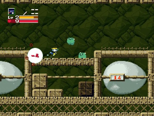
Studio Pixel’s Cave Story is one of my favorite games. Created, designed, illustrated, scored, and programmed by one person — Daisuke “Pixel” Amaya — it is often credited for sparking the indie game revolution of the last decade.

It is a meticulously crafted and thoroughly fun non-linear action game, with a good story, strong characters, and wonderful 16-bit sensibilities.

20140905_kero_blaster_0

Cave Story has gone on to be ported and enhanced across several different platforms, and many fans — including myself — have been eagerly awaiting his next big release.

In May of 2014 — nearly ten years after Cave Story — our wishes finally came true. With additional help from Kiyoko Kawanaka, his latest game Kero Blaster has arrived.

20140905_kero_blaster_1

“Kero” is the Japanese equivalent of “ribbit” in English, and the title itself sounds like a play on “ghetto blaster”, those giant boomboxes from the ’80s. Fitting, given the oldschool graphical and musical stylings of this game.

Those going into Kero Blaster expecting Cave Story II may be slightly disappointed. If Cave Story was Amaya’s tribute to games like Super Metroid and Castlevania: Symphony of the Night, Kero Blaster is his Mega Man and Super Castlevania IV. It’s shorter and linear, but just as fun and entertaining.

20140905_kero_blaster_2

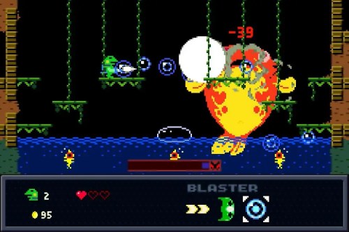
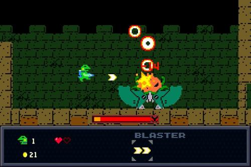
At its heart, Kero Blaster is a side-scrolling action platformer with run-and-gun sensibilities. You play a no-nonsense, blue tie-wearing frog who has an acquirable double-jump ability, a sweet bomber jacket for added protection, four upgradeable weapons, and various other health boosts which can be purchased at shops throughout each of the game’s seven stages.

Your frog controls well, although I found him to be a little too — dare I say — slippery at times, but rarely did the slightly loose controls lead to my demise. His double-jump controls do take some getting used to, and will feel more natural once you understand that double-jumping straight up takes you higher than diagonal ones.

I appreciated being able to use my Xbox One controller to play this game. I remapped my controls — preferring to use the bumpers to cycle through weapons — and away I went.

20140905_kero_blaster_7

The weapons at your disposal also have a range of pros and cons. Some have a limited reach, some are better in specific environments, while others are very potent, but concentrated, like Contra III‘s laser vs. spreadfire.

All of them are fun to use and look great. I utilized each of them up to the very end, which shows how much thought Amaya put into their design.

20140905_kero_blaster_5

Most of the game’s levels are uniquely designed, with some asset reuse occurring during the game’s final act. This is all part of the game’s story, however, and it works extremely well in showcasing how far your little green hero has come.

Each level is fun to explore, and figuring out the best way to dispatch enemies is one of the game’s best qualities. There are also a good number of secrets to uncover — including a fifth weapon — which takes a New Game+ playthrough to acquire.

20140905_kero_blaster_8

Speaking of New Game+, like many other games, you can play through the levels again with all of your gear. In Kero Blaster‘s case, however, you’ll start over with only one heart and no cash, but hey, a small price to pay for looking so cool.

In fact, New Game+ is where the game truly comes to life. It’s certainly fun the first time, but going through the levels again — without any of the cutscenes to slow things down and powered-up — is quite literally an absolute blast. There are also some extras to be had for those who play through the game at least twice.

20140905_kero_blaster_3

Kero Blaster‘s visuals are wonderful. The frog you control is charmingly simplistic and flat-shaded, as are many of the creatures and characters you run into throughout the game. While they may look rather basic in screenshots, every character is animated nicely, with tons of personality, vibrant colors, and memorable design.

The world graphics are matched perfectly to its inhabitants as well, with excellent foreground and background separation, clear platforms, and smoothly scrolling playfields.

Kero Blaster‘s music and sound effects are also very good, and classic game music fans will find a lot to enjoy here. It’s not as uniquely synthy as traditional 8-bit soundtracks tend to be, but it still has its strong points, with certain tracks sticking in your head long after you’ve turned the game off.

20140905_kero_blaster_6

In terms of difficulty, Kero Blaster feels just about right. It’s surprising how easy it is to take damage, and even with a decent amount of heart containers and reserves, I died quite a bit. Checkpoints throughout each level are generous, but if you lose all of your lives, you have to start the stage over from the beginning. Fortunately, you don’t lose anything in the process. A Game Over can sometimes even be a good thing as you’re able to gather more money retracing your steps, allowing easier and faster upgrades to your frog’s deadly arsenal.

I did run into some annoying bugs, like the fact that I had to manually terminate it via Windows 7’s Task Manager in order to properly close it. It wouldn’t launch again otherwise. Also, perhaps due to the number of on-screen sprites — of which there are a lot at times– the game had a tendency to chug a bit, tarnishing an otherwise very polished exterior.

Additionally, a very minor point is the English font. It gets the job done, but I don’t like the fact that the font pixels are smaller than the ones in the game itself. They don’t match, so hopefully this is something that can be updated in a future patch to really make everything cohesive.

The interface is also simplistic, with no display or sound options except for being able to choose the window size. Even going full-screen didn’t fill my entire monitor, possessing a dull gray border around all four sides.

20140905_kero_blaster_4

Kero Blaster is short, at just about 5 hours for two complete playthroughs. However, it’s the kind of game you can’t stop until you’re done, and even after that, it compels you to come back and discover all of its many secrets.

While it may not have the historical significance that Cave Story did, it’s still a very fun game that represents all the best qualities of Amaya’s incredible talent.

  • Graphics & Presentation: A-
    Charming, simple spritework with clean and consistent background art. Good environmental variety, parallax scrolling, and trademark Pixel visual design and color.
  • Music & Sound Effects: B+
    A very good oldschool-style soundtrack with crisp sound effects. The PC version’s sound files can be played directly with Pixel’s free audio player, which is a nice bonus.
  • Gameplay & Controls: B+
    Solid controls and a good strafing mechanic make you one deadly amphibian. Linear design doesn’t leave a lot of room for exploring, but they do contain some hidden alcoves that take repeat playthroughs to uncover. Great weapons and enemy/boss design.
  • Value: B
    This is a quick game that isn’t too hard, so most players will get through it the first time in about three hours. New Game+ is a lot of fun and worth playing through at least once. Cutscenes are removed on subsequent playthroughs to keep things moving at a brisk pace. For $8 ($5 on iOS), this is a good value.

Overall: B+


Facebooktwitterredditpinterestlinkedinmail